

Howard Brothers are one of Europe’s leading joinery specialists, trusted by architects, designers, and construction firms across London and beyond. They partnered with Make Studio to create a new identity and website. The goal was clarity, confidence, and a visual language that matched the quality of their work.
One of the concepts Make Studio was working on, was a design system that was built on the idea of craft that transform spaces. What makes Howard Brothers unique, is their focus on building environments that are inspired by true craft.
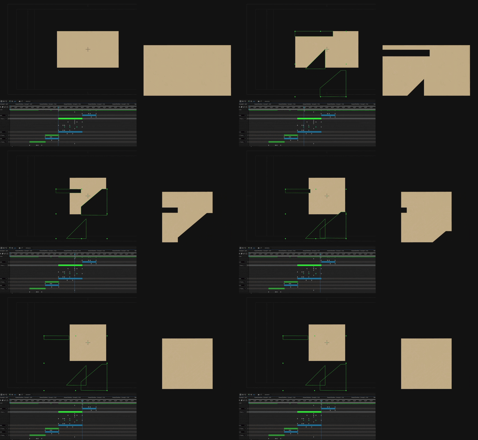
My role was to dive into the design system the team has built, and create a motion identity. My approach was inspired by the idea of shapes coming together, and also wanting to re-create the craft of joinery - taking a shape away, creates another shape. The technical bit around this, was to create the original shape, then trace the individual parts that will be animated on top, create a square, and then Alpha Matte the individual parts to the square. The rest was just to figure out wich shape comes first and how this will connect to the next group of shapes.
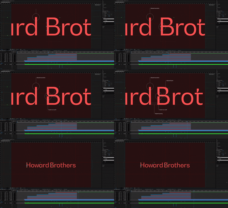
The second concept the Design team explored was inspired by modern patterns styles. I focused on the typography (Gradual) as there was a good space to explore the ident cuts of the text. The idea was to use the geometric genre and focus on the deep joints. I took a similar approach as Concept 1, where shapes are being taken away to reveal another shape, for me that was the connection to craft.
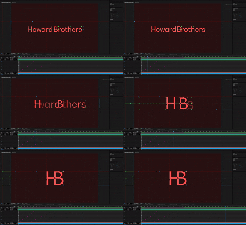
I isolated the text and created outlines, then separated each individual character and animated the scale/position. I took main inspiration from the original design, where the text had lines with text describing how the text (logo) has been changed.

Once the brand direction was shaped, the team dived into creating Howard Brothers new website. I was tasked with creating animations that will appear on the main page, as the usser scrolls.
One of the directions I was given by the Creative Art Director was to use the shapes, and loop them. There was a question of the final output, as this is meant to be for website I though the animation should be created as Lottie file (faster, smaller file). The animations I created were a balance between tradition and innovation, reflecting both the human skill and technical precision behind their craft.
When all work was signed off, we created internal animation for our Case Study. It was fun to dive back into the motion direction, as this time I had more space to explore other alternative transitions and aimations.
The new brand identity takes direct inspiration from joinery geometry. Using jointing forms as a foundation, we developed a modular design system that can flex across print, digital, and environmental applications. A colour palette rooted in natural wood tones adds warmth and authenticity, while a new photography suite captures both the craft and architectural scale of their work.
It showcases their portfolio, explains their process, and communicates their expertise with the confidence of a true industry leader. The result is a brand that honours its craft while looking firmly ahead, positioning Howard Brothers as one of Europe’s most respected joinery specialists.